Strategic Brand Experiences
BRAND IDENTITY
BRAND IDENTITY
Miele —
From trust in quality
to iconic premium experience.
Miele —
From trust in quality to iconic premium experience
Miele —
From trust in quality to iconic premium experience
Miele —
From trust in quality to iconic premium experience
Miele —
From trust in quality
to iconic premium experience
About the business
Miele is a German family-owned company with strong heritage and a well known reputation for trusted quality in the sector of premium household appliances around the world.
Challenge
Miele products are built to last. People trust in Miele quality and the actual product experience matches their expectations. However, there was a gap between the perception of the product and the perception of the brand which didnt reach up to the premium aspirations.
Deliverables
Brand audit
Brand positioning
Brand architecture
Purpose & Vision
Brand character
Logo design
Claim application
Color system
Imagestyle
Brand guide
Brand implementation
Agency
MetaDesign
Team
Jörg Sesselmann
Thomas Maes
Nicolas Glagow
The brand identity lacked a clear positioning and a distinctive brand experience. Besides that, there was a lack of consistency and digital media requirements demanded a new design system. Under pressure by low-price competitors and discerning customers, it was about time to redefine „Immer Besser“.
Solution
Throughout several management interviews, workshops and meetings with all departments, we gained major brand insights. Additional competitor analysis and target group research built the foundation for a clear positioning. Miele was already perceived as a trusted partner for quality but there was a need to become more desirable, premium and visionary.
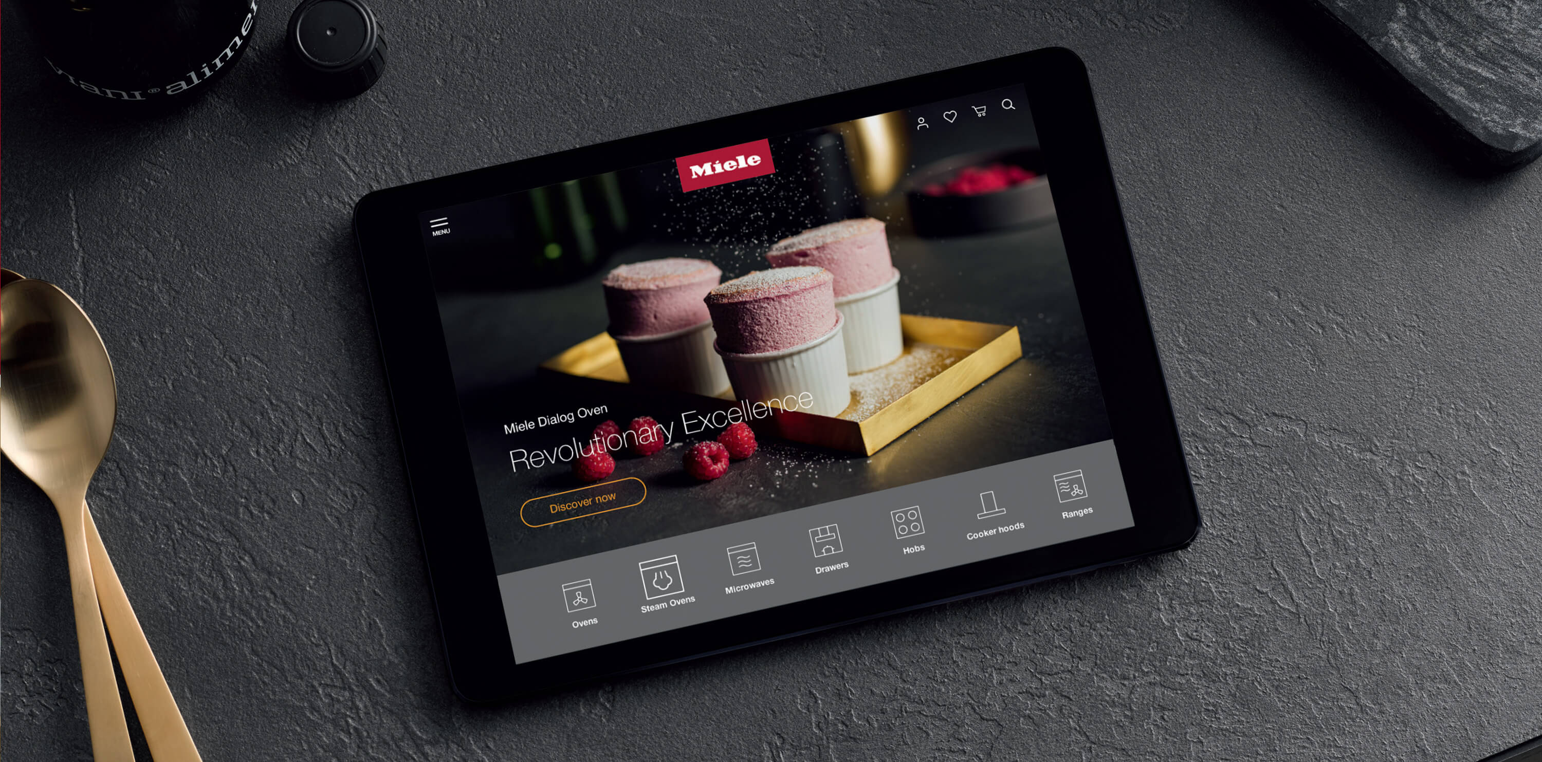
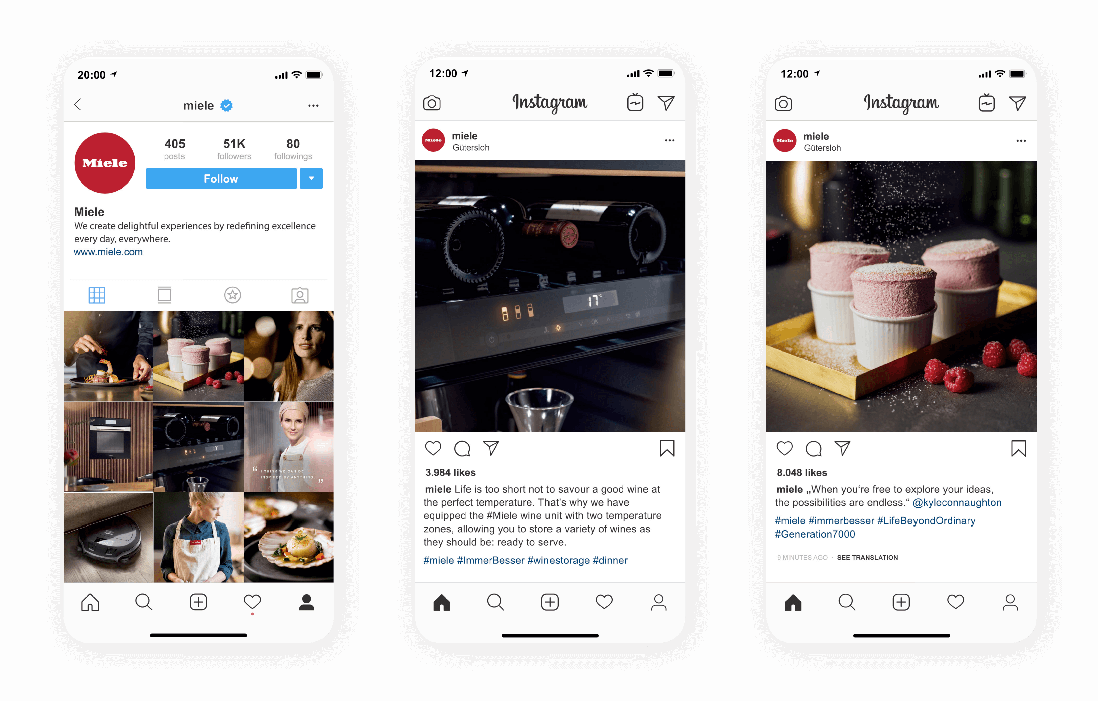
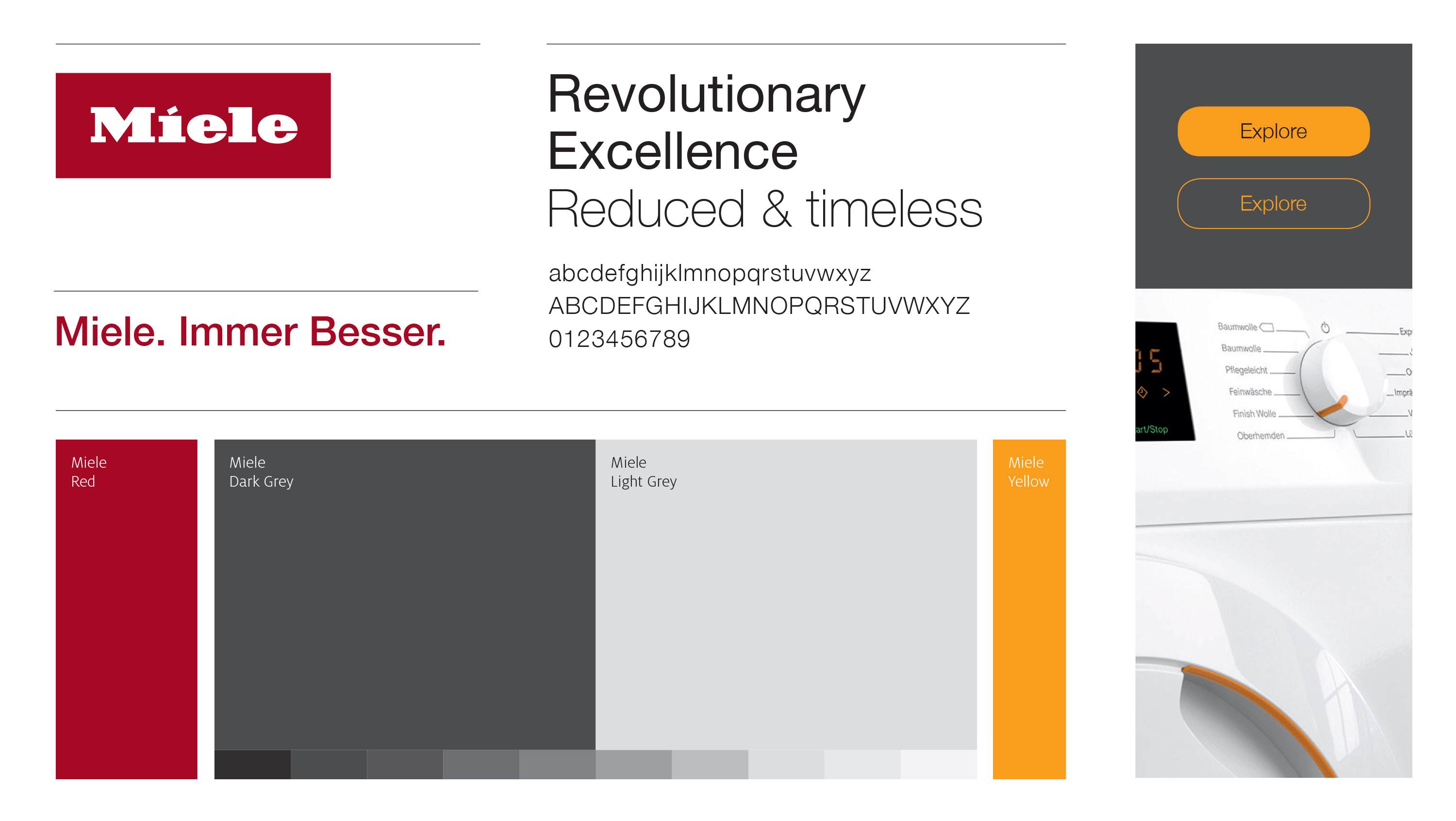
This led up to a new purpose statement, a new vision, beliefs and a new brand character, serving as a guiding compass for the new brand experience. In addition to that, a new brand architecture enabled us to restructure the visual inconsistencies. The new brand experience included a new logo, claim application, color system, image style, typography and tone of voice.
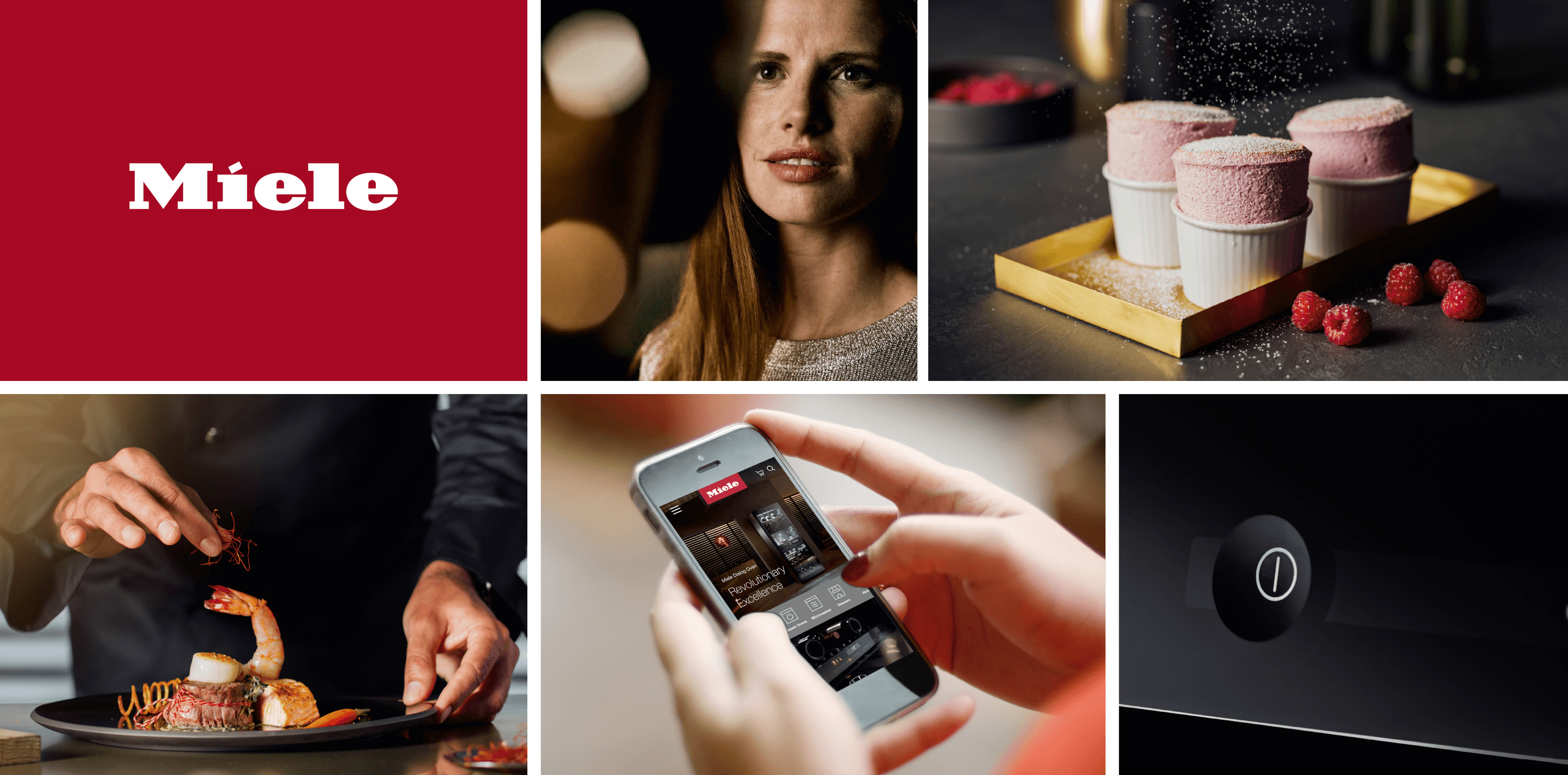
PURPOSE
Immer Besser.
We create delightful experiences by redefining excellence every day, everywhere.
PURPOSE
Immer Besser.
We create delightful experiences by redefining excellence every day, everywhere.
VISION
Miele is the world’s most trusted and desirable premium brand.
VISION
Miele is the world’s most trusted and desirable premium brand.
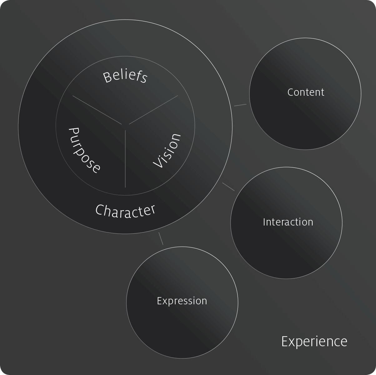
Building the bridge between past and future, between culture and ideal
Beliefs, purpose and vision form the strategic foundation of the new Miele brand.
The brand character is derived from there and serves as the guiding compass for all dimensions of the brand experience to enable a coherent, unique brand perception at every touchpoint.
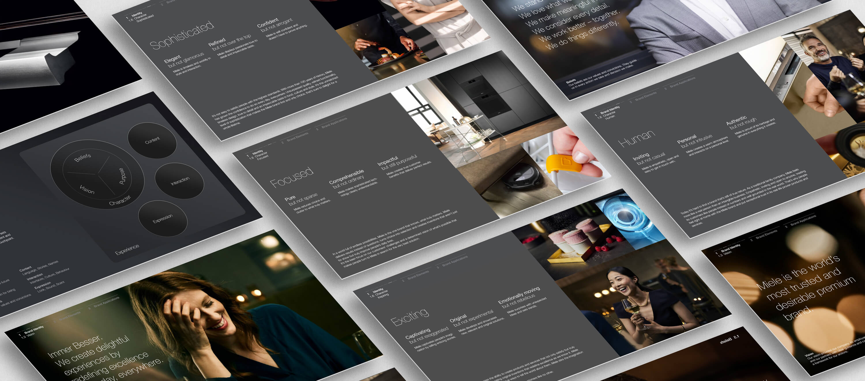
Several workshops enabled us to identify core attributes of the new identity.
BRAND CHARACTER
The brand character translates strategy into actual experience. It is a set of experience principles which guide the emotional perception of the brand experience at every touchpoint.
BRAND CHARACTER
The brand character translates strategy into actual experience. It is a set of experience principles which guide the emotional perception of the brand experience at every touchpoint.
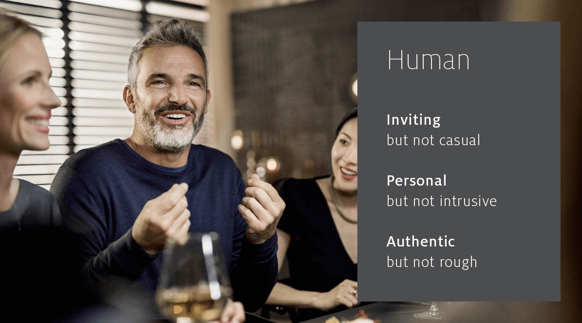
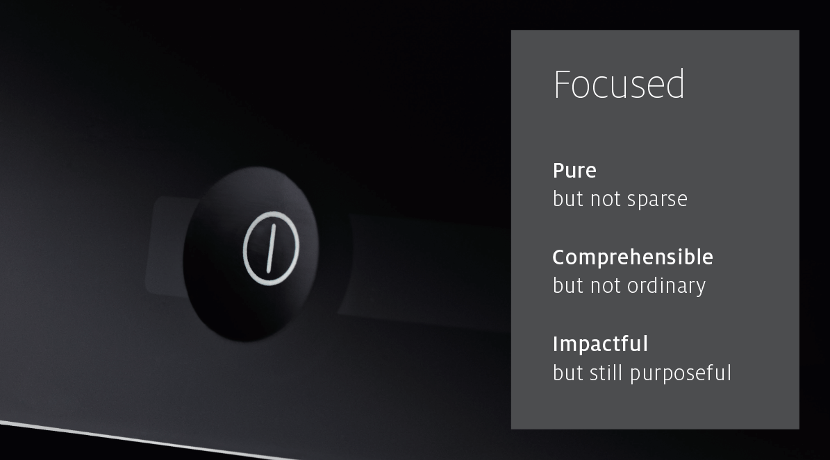
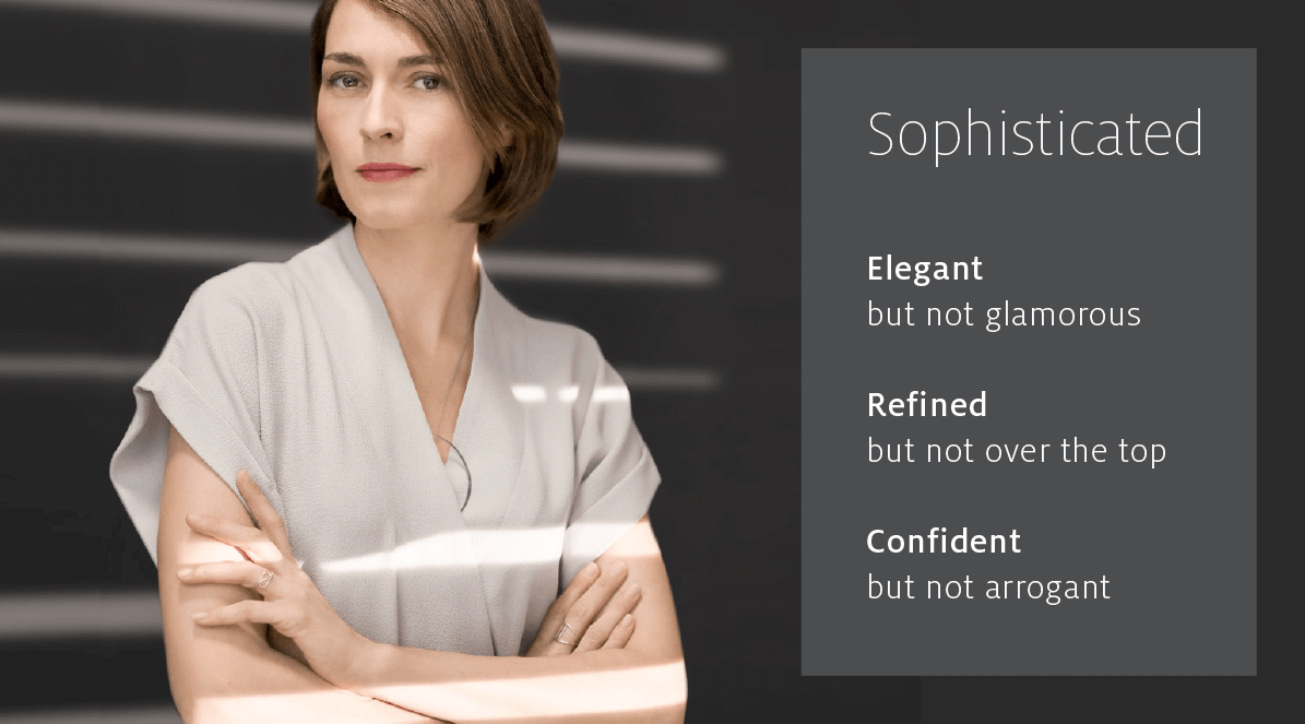
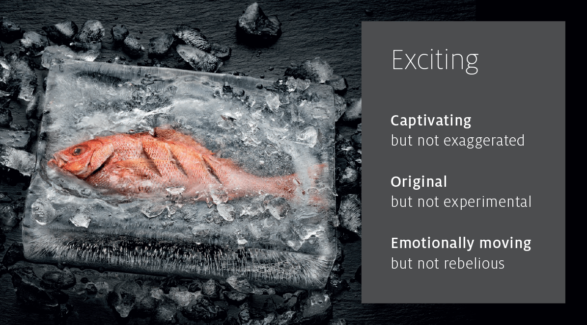
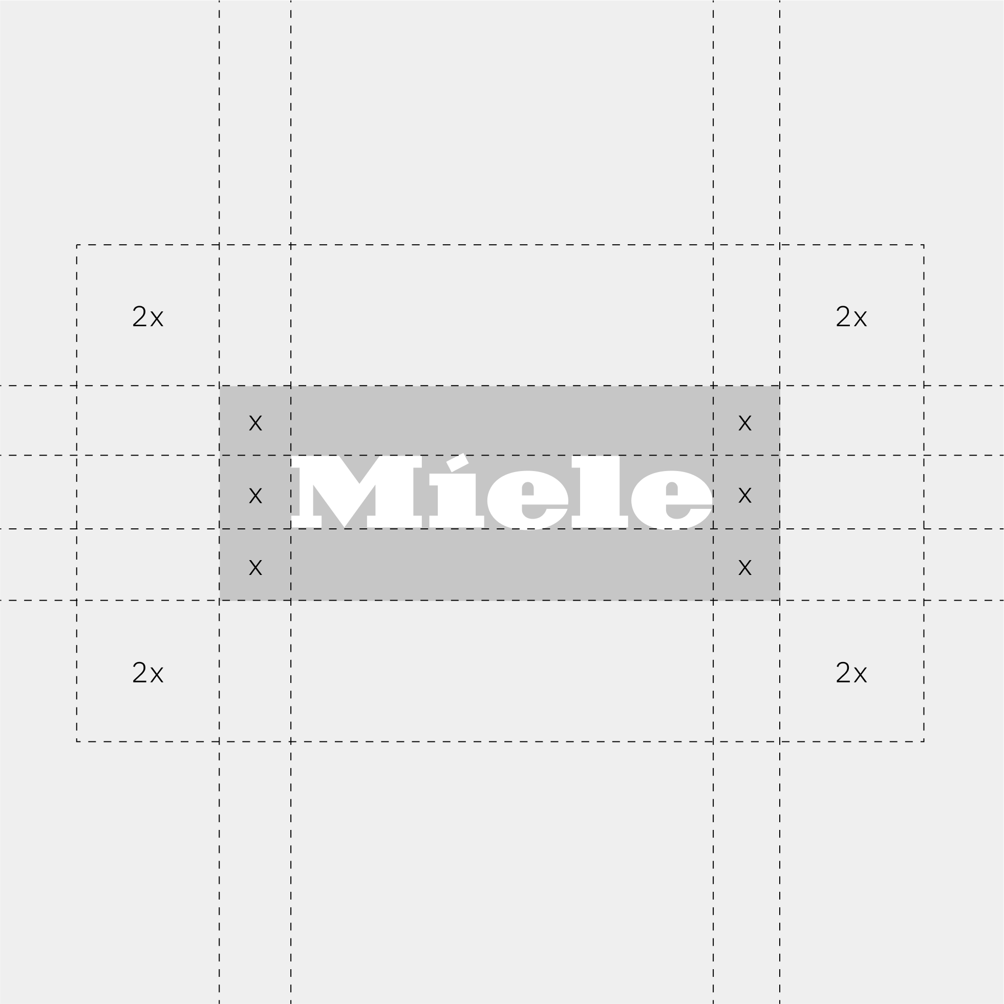
Iconic evolution
The Miele logo has remained essentially unchanged since 1949. Accordingly, we needed to clarify the most distinguishable characteristics of the logo before starting into an evolutionary design process.
In the next step, we challenged the application of the logo. Center-aligning it at the top margin of the format ensures an optimal brand recognition for all media touchpoints and also proclaims a confident leading position within the houshold appliances segment.
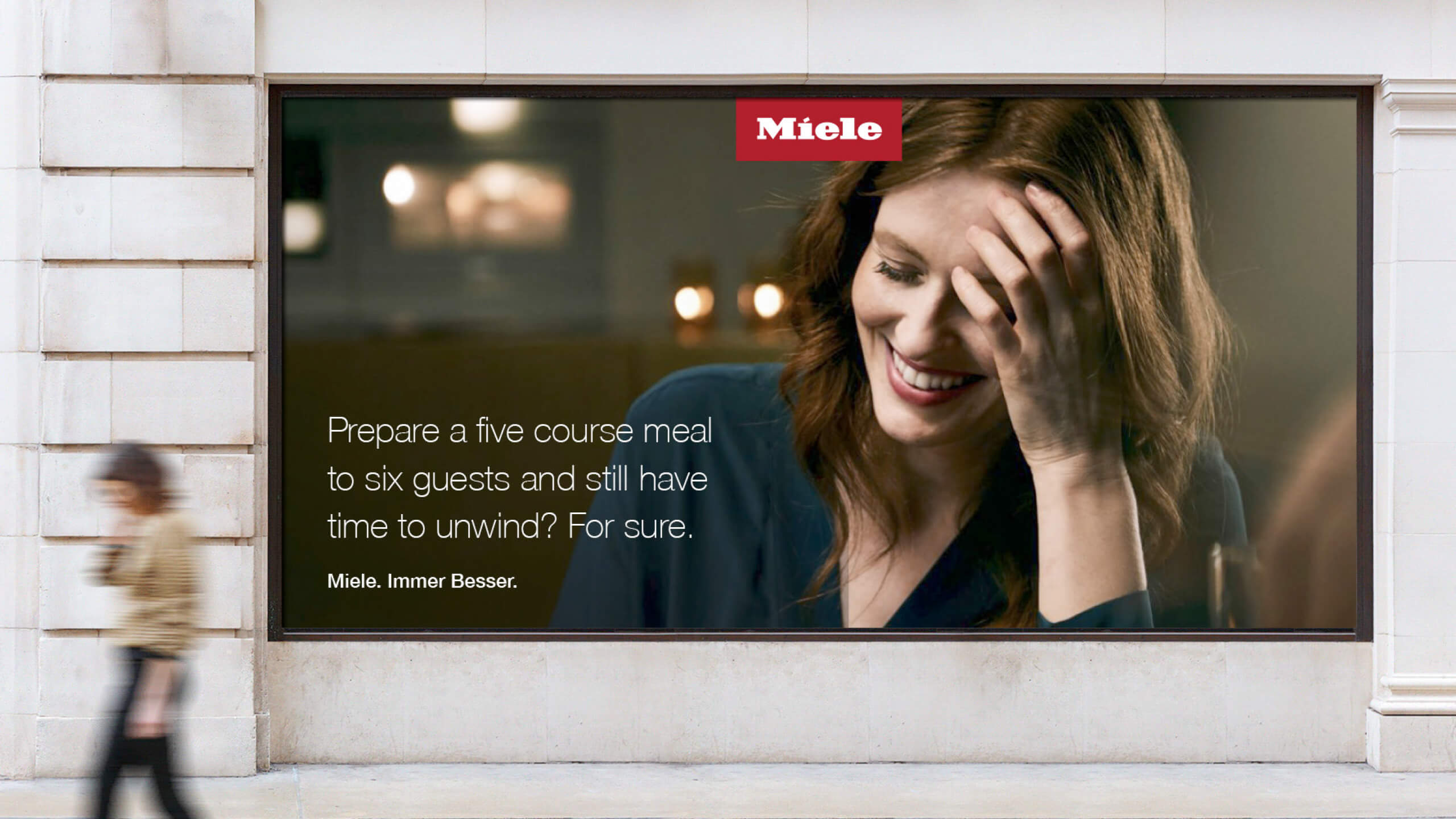
Giving cause to a more communicative approach, the claim which used to be attached to the logo, now concludes stories and messages of the brand communication.
Miele. Immer Besser.
LOGO HISTORY
LOGO HISTORY
LOGO HISTORY

Color: The old signal red becomes a darker, subtle red, which feels much more sophisticated.
Generous space: The spacious red quality seal let‘s the wordmark breathe and expresses the brand’s premium aspirations.
Reduction: The Claim is detached from the logo.
Color: The old signal red becomes a darker, subtle red, which feels much more sophisticated.
Generous space: The spacious red quality seal let‘s the wordmark breathe and expresses the brand’s premium aspirations.
Reduction: The Claim is detached from the logo.
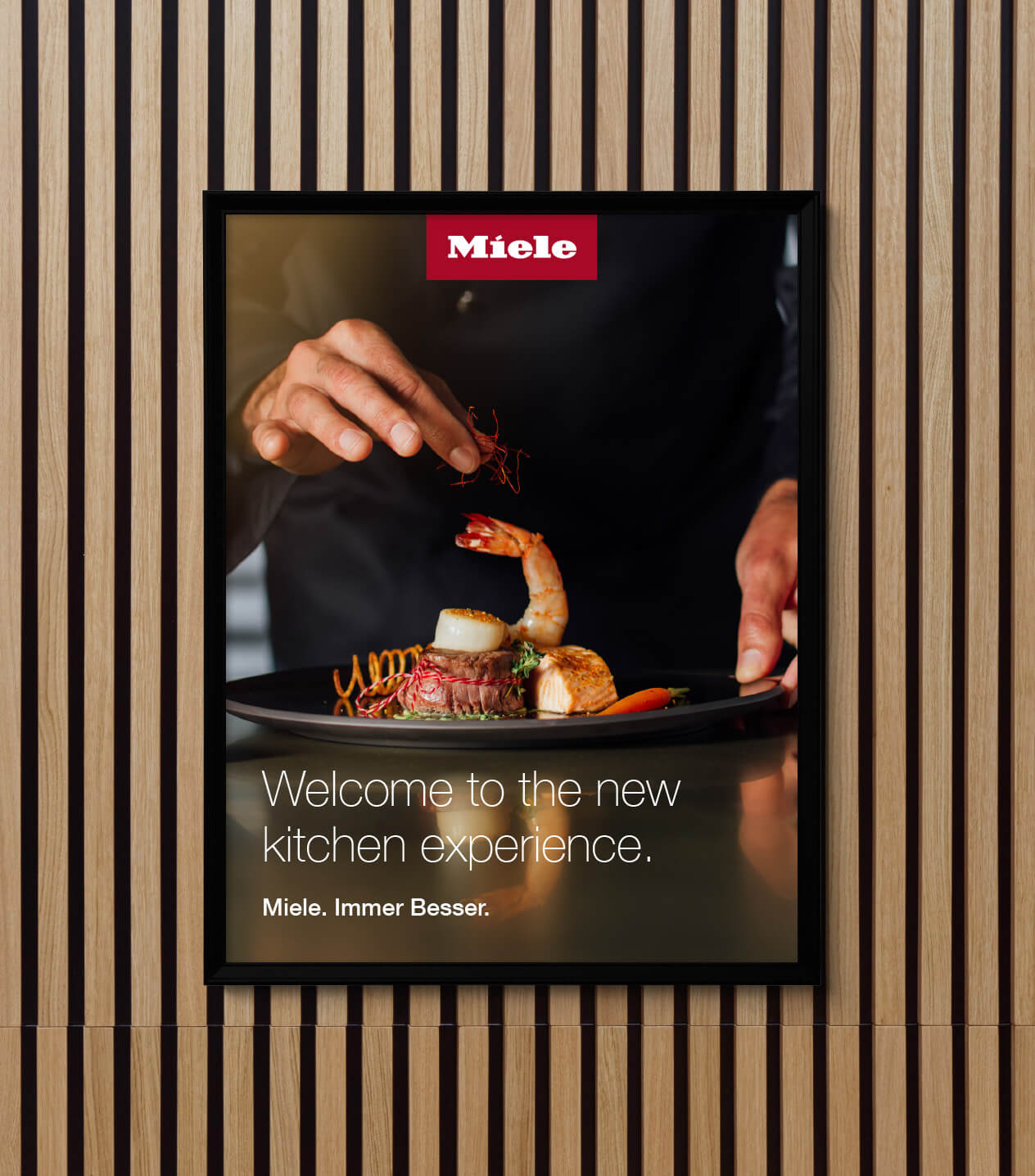
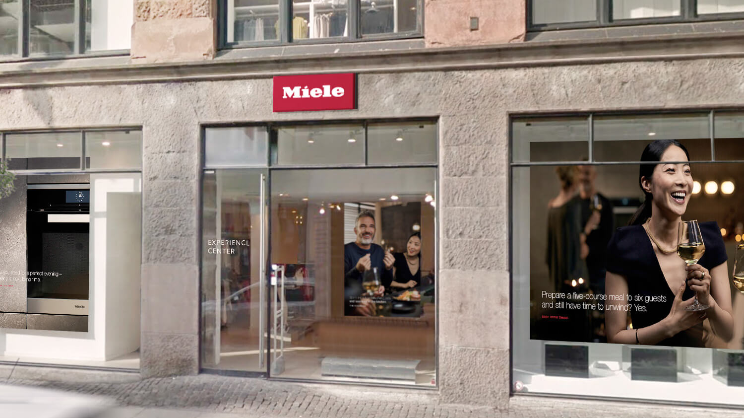
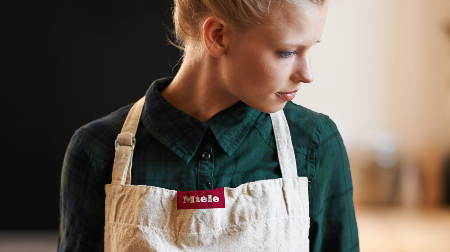
Image style
The old image style was pretty diverse. Either it was lacking a feel of sophistication or lacking a sense of authentictiy because setting and people felt too staged. Nevertheless, the overall perception was pretty cold and sterile.
The new image style needed to merge the gap between the character atributes „Human“ and „Exciting“ on one end of the spectrum and „Sophisticated“ and „Focused“ on the other side.

Key style
elements of the Miele imagery
Key style elements of the Miele imagery
Key style elements of the Miele imagery
Key style elements of the Miele imagery
Key style elements of the Miele imagery

Key story
elements of the Miele imagery
Key story elements of the Miele imagery
Key story elements of the Miele imagery
Key story elements of the Miele imagery
Key story elements of the Miele imagery

OLD BRANDING
OLD BRANDING
OLD BRANDING

Hypoport
Jonas Husemann
Strategic Brand Experiences
I'd love to hear from you.
Email info@jonashusemann.de
Or call +49 176 24 616 232
Contact
+49 176 24 616 232
info@jonashusemann.de
www.jonashusemann.de
Fonts used on this website
New Kansas by Newlyn
Restart Soft by Superior Type
© 2025 Jonas Husemann
Inhaltlich verantwortlicher Autor für diese Webseite ist Jonas Husemann. Trotz sorgfältiger inhaltlicher Kontrolle übernimmt der Autor keine Haftung für die Inhalte externer Links. Für den Inhalt der verlinkten Seiten sind ausschließlich deren Betreiber verantwortlich. Alle Rechte vorbehalten. Text, Bilder, Layouts, Grafiken und Videos sowie deren Anordnung auf diesen Webseiten unterliegen dem Schutz des Urheberrechts und anderer Schutzgesetze. Die Inhalte dieser Webseiten dürfen nicht kopiert, verbreitet, verändert oder Dritten zugänglich gemacht werden.
Building identity